The Playroom
DESIGN ROLE
Art Direction
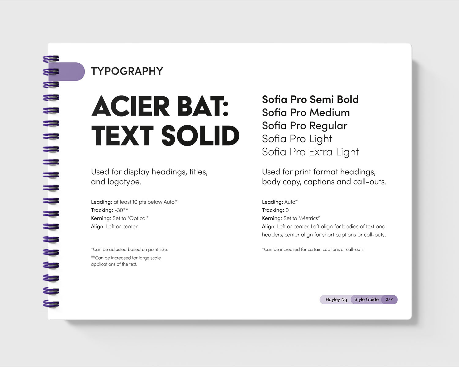
Typography
Brand Experience
Environmental Design
Art Direction
Typography
Brand Experience
Environmental Design
Course: COMD-300 Core Design Studio, Instructor: Leo Vicenti
Vancouver Urban Ministries is a non-profit organization that tutors low-income families in and around the Downtown East Side. With the return of in-person tutoring sessions, VUM needed an extension of its tutoring program and visual language to express its commitment to providing a holistic learning environment for its students.
The fictitious brand extension, Playroom, draws from VUM’s current colour palette and ethos of creating a healthy space for students to learn and play. With lively visual elements that invite students to play, a 3D model of the potential space shows how this identity could live in a physical space.

Research Phase
Through researching VUM, who they were, and what makes them stand out, there were a lot of similarities between their morals and the first three tiers of Maslow’s Hierarchy of Needs—physiological needs, safety needs and belonging, and love needs. Based on these three needs, and in conjunction with VUM’s philosophy, it became clear that a successful education prioritizes making the most of a student’s capabilities and resources and a healthy learning environment.

Maslow’s Hierarchy of needs in conjunction with VUM’s main philosophies.
Exploration Phase
The potential space for the room had to have an existing structure that would encourage and add to the playful nature of the new identity. Near VUM's tutoring headquarters was the kids' room of Vancouver Public Library's Strathcona branch downtown. The vibrant colours and toys in the room inspired the title of the extended brand, "Playroom." With sliding glass doors and easy access to cupboards and sinks, this room was the right fit for students to decompress and have fun.
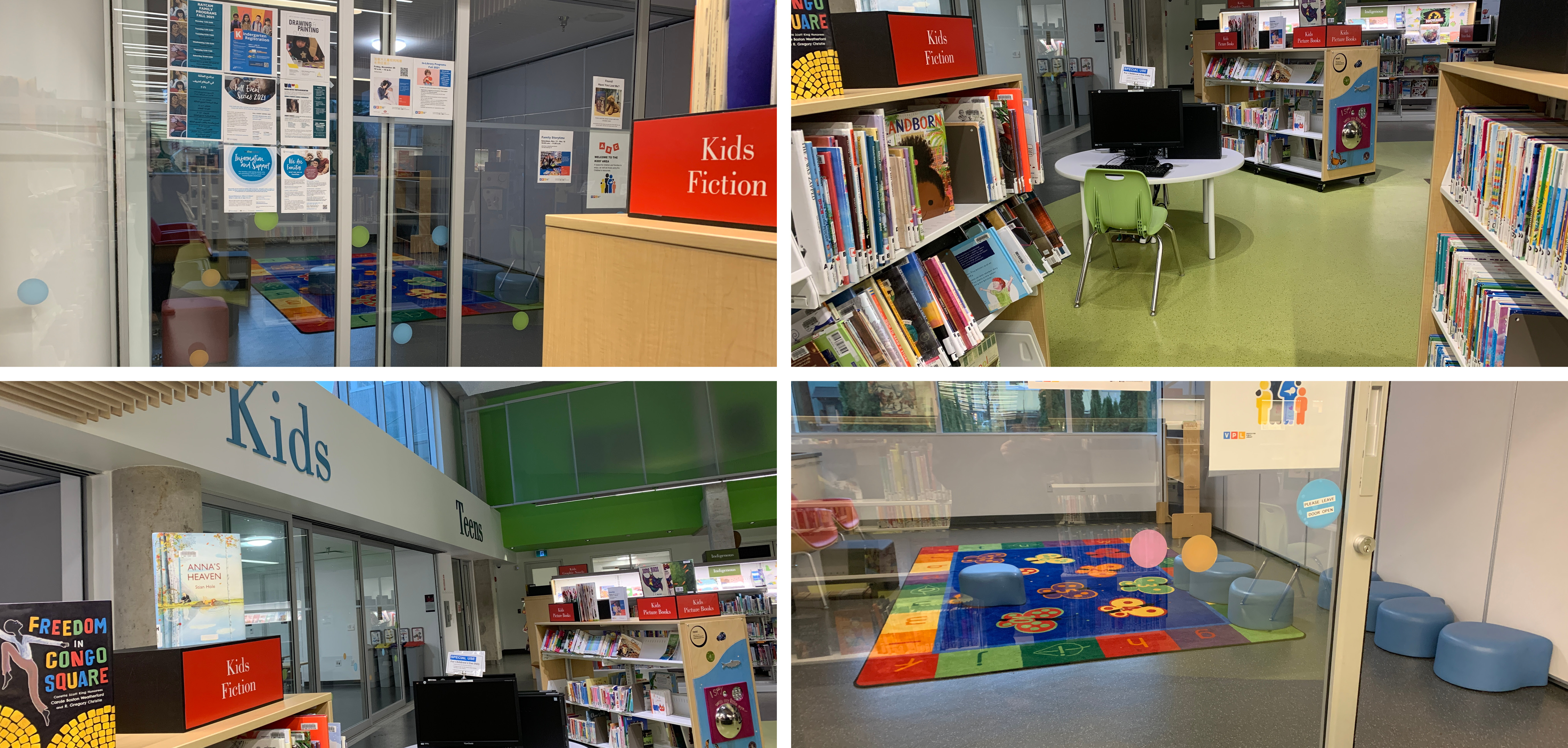
Vancouver Public Library’s Strathcona library: kid’s play room and area.
Brand Experience
Developing the brand based on play required a refresh of VUM's current colour palette. Saturating the existing brand colours allowed the brand to show playfulness while still owning the friendly and approachable nature of the original palette. Staying in line with VUM's commitment to access all children with learning difficulties, Acier Bat and Sofia Pro provided good legibility for students struggling to read with its anatomy, similar to how VUM teaches their students to write letters.

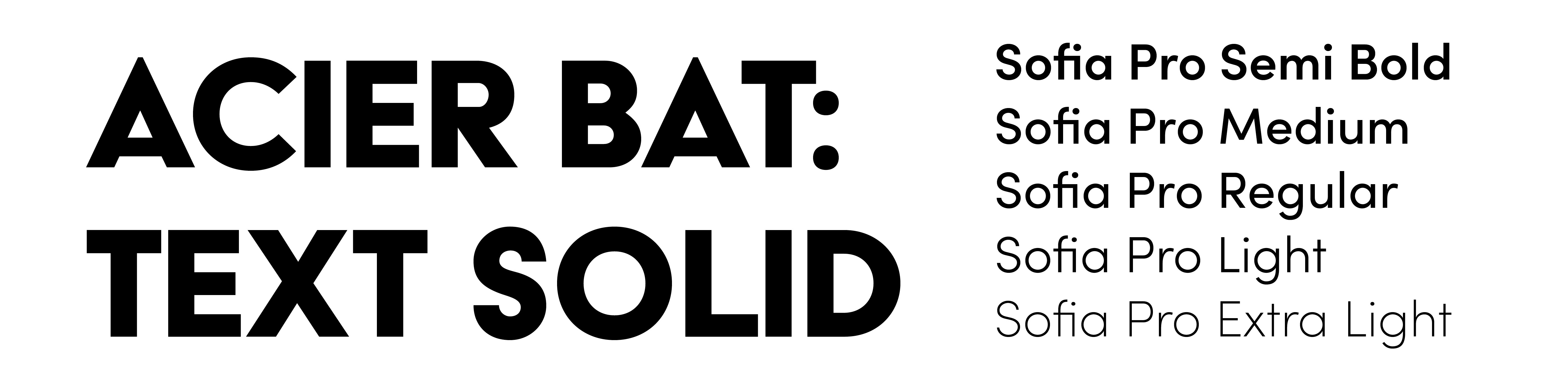
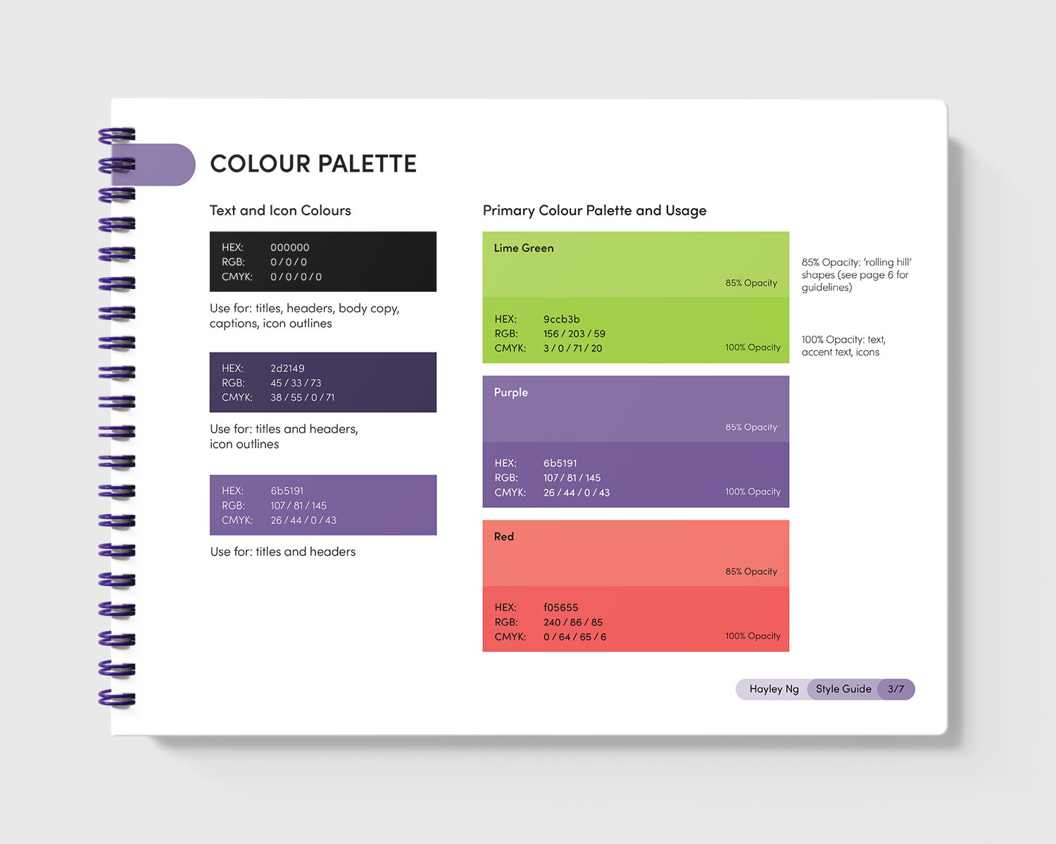
Playroom's primary colour palette, font colours and font pairing.
Typography
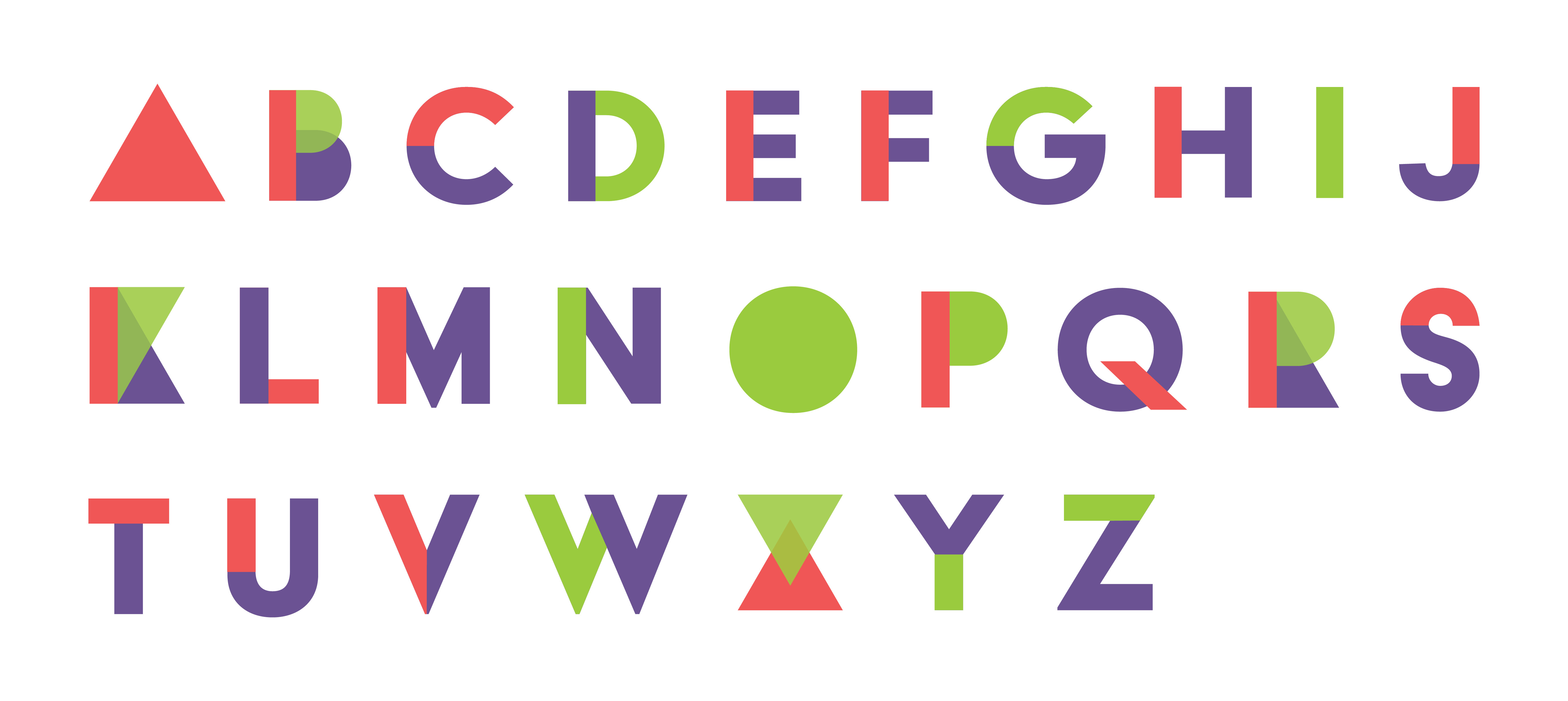
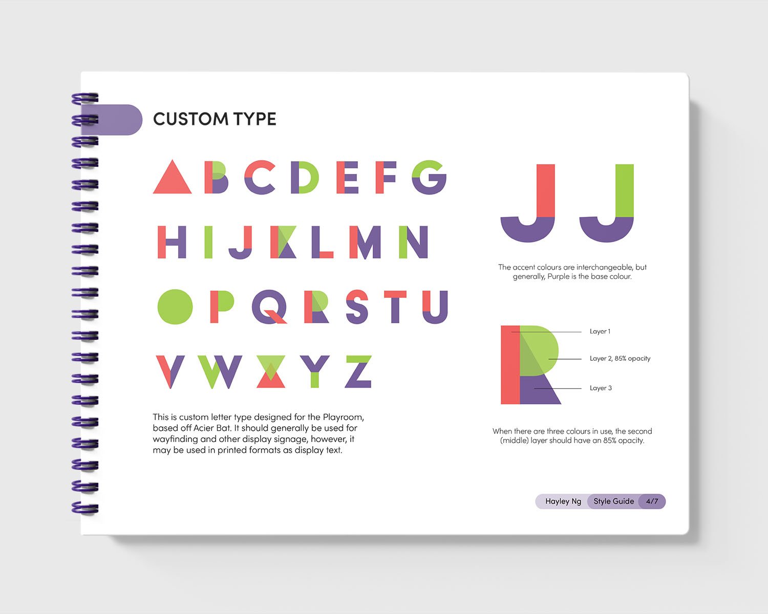
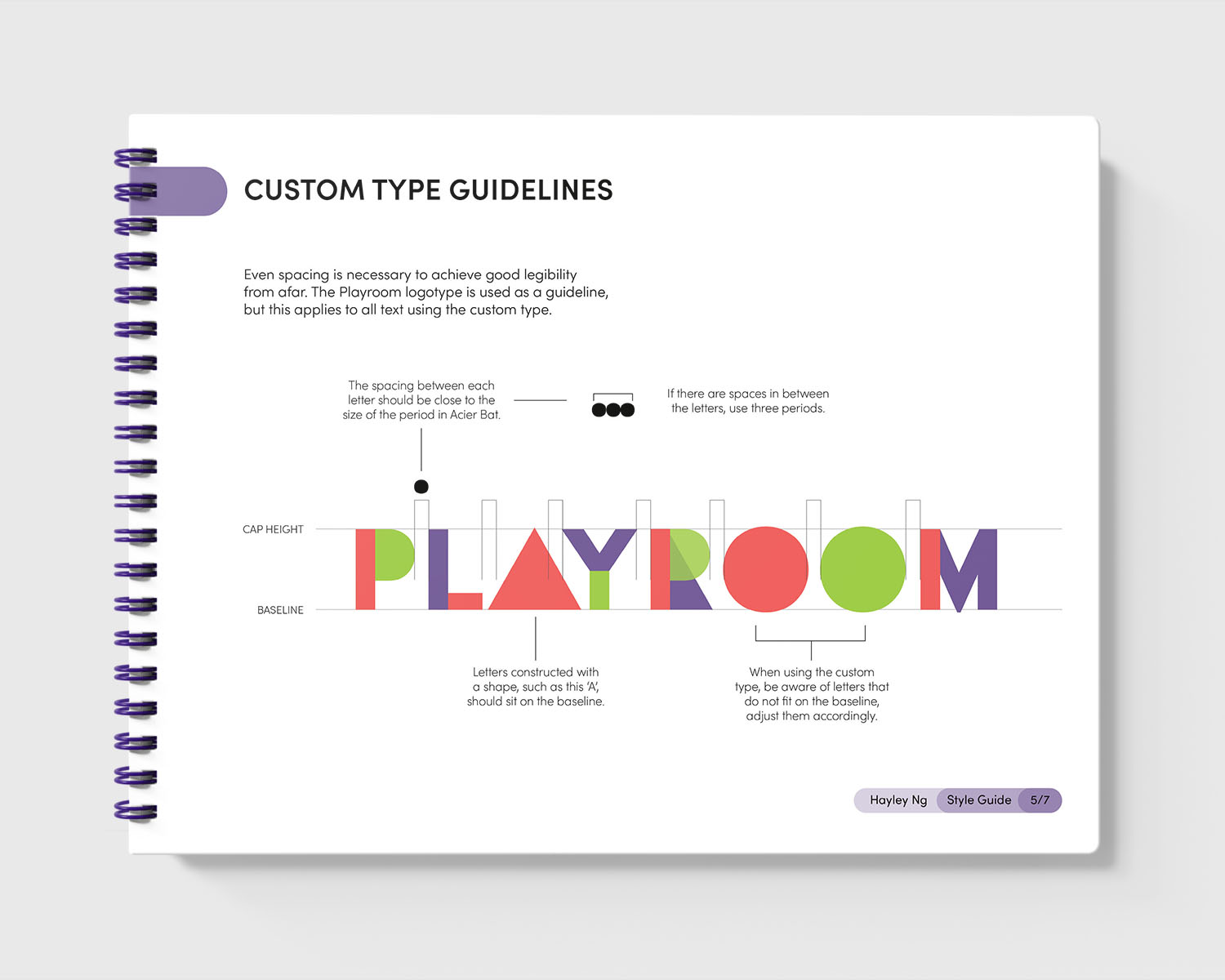
As for the typography, the display typeface, Acier Bat, was deconstructed into basic shapes, such as circles, squares and triangles, to form custom typography that speaks to VUM's tutoring approach, where students start by learning and strengthening the fundamentals, similar to how children first learn geometry through basic shapes. The custom letters can be used as display type or for signage, enabling the brand to exist and adapt to different rooms and locations.
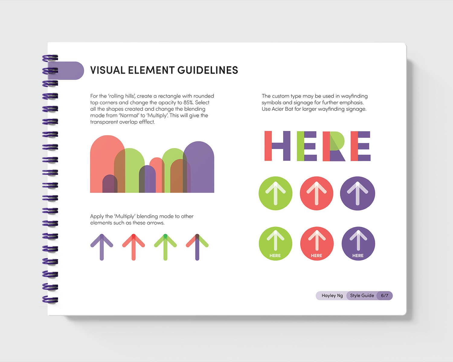
The 'rolling hill' imagery emerged as a combination of circle and square shapes from the typography to represent steps when overlapping one another and the outline of a person when alone. This versatility of the rolling hill opens up different avenues for usage in wayfinding and brand application.
The 'rolling hill' imagery emerged as a combination of circle and square shapes from the typography to represent steps when overlapping one another and the outline of a person when alone. This versatility of the rolling hill opens up different avenues for usage in wayfinding and brand application.
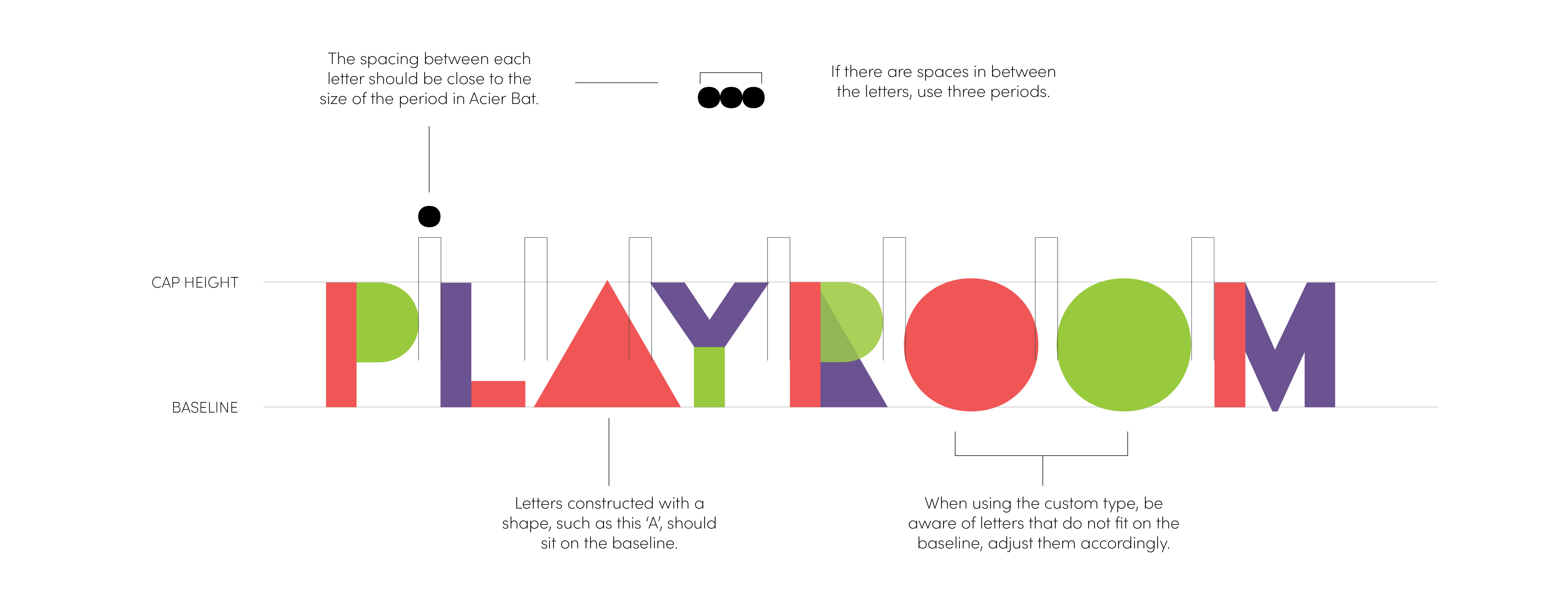
An overview of the custom type and the guidelines for it.
Environmental Design
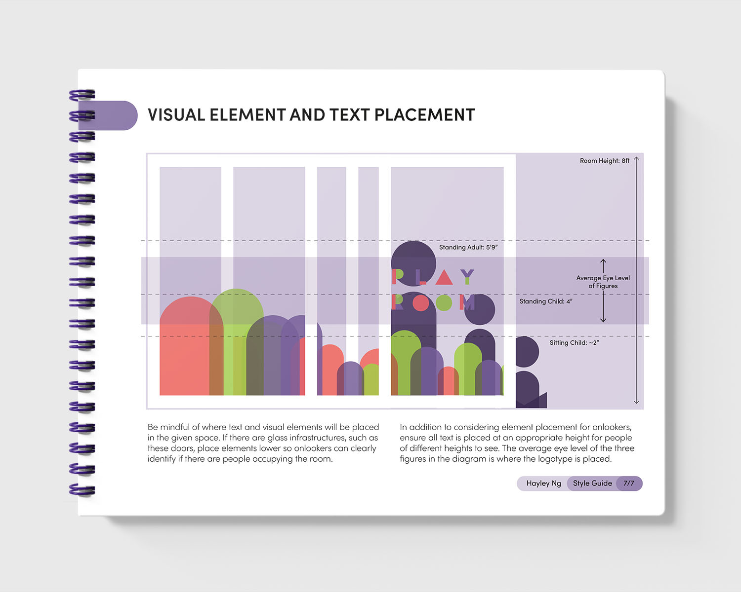
The visual elements on the sliding glass doors of the play area at the Strathcona VPL branch account for the heights and positions that adults and children may be in at any given time. In addition to the placement of the vinyl being higher or lower, the rolling hill shapes are transparent to ensure extra visibility into the room for the safety of the students, adult supervisors and patrons of the library.
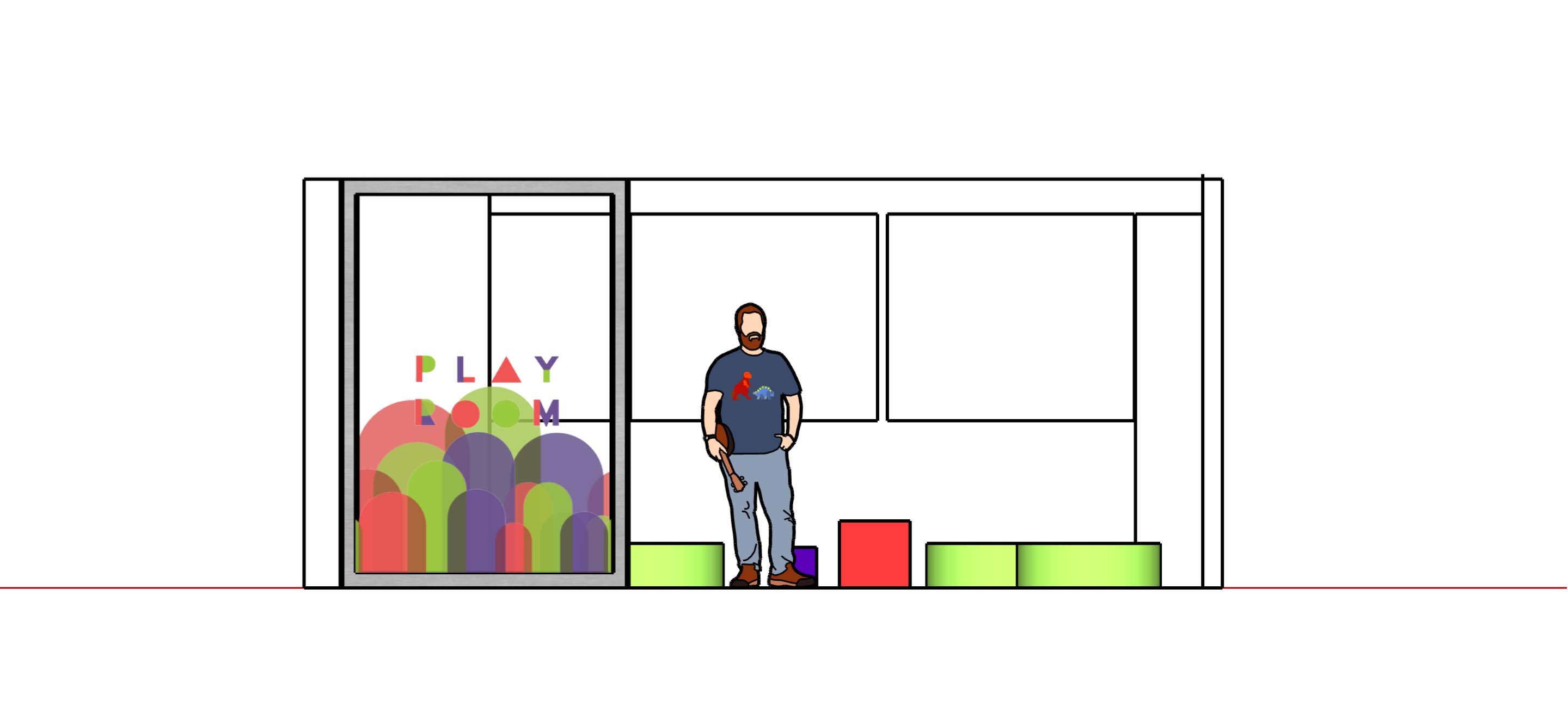
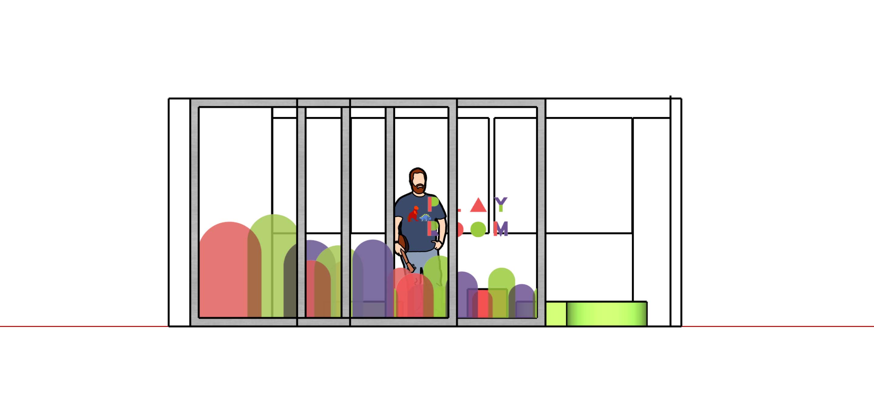
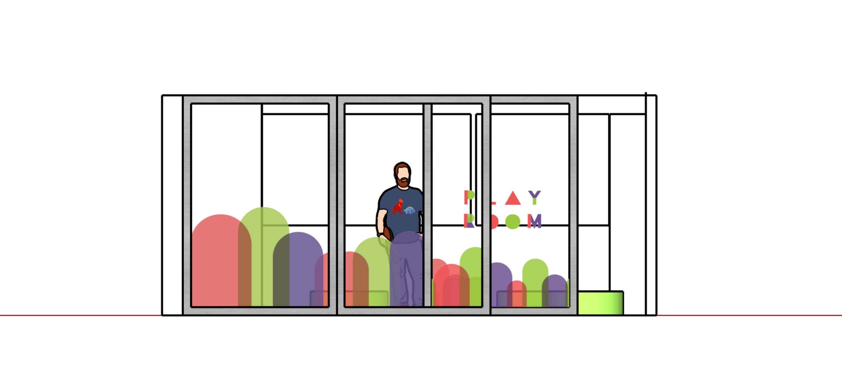
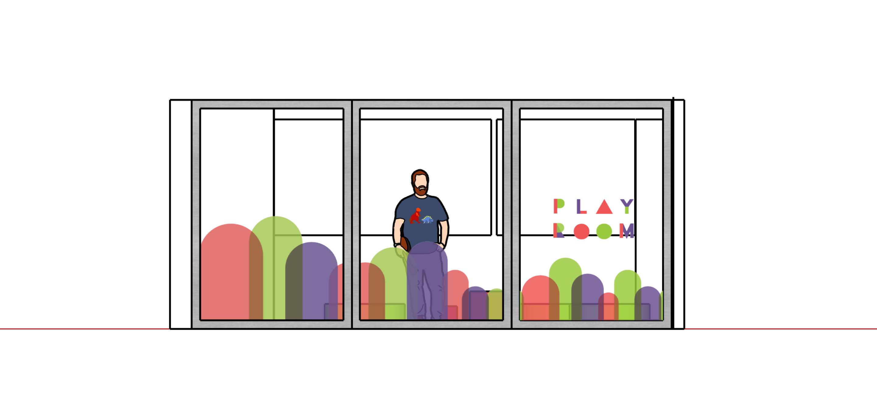


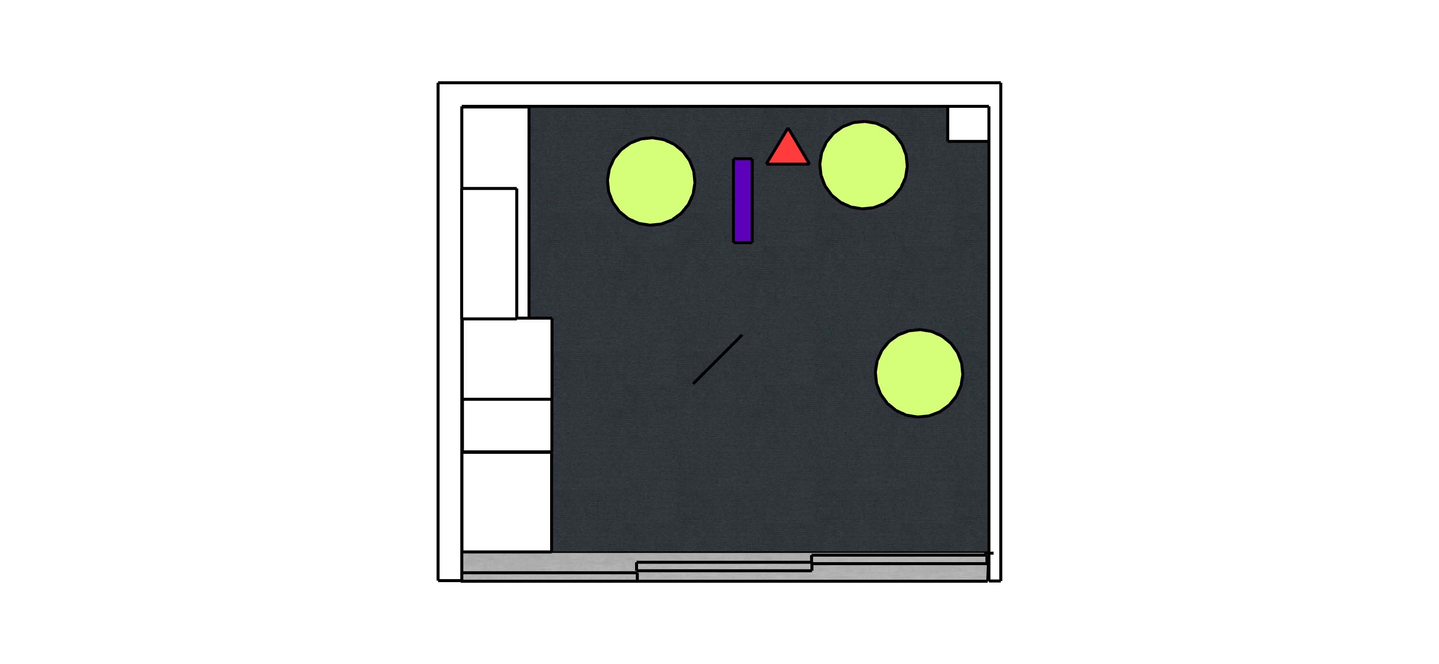
Screen captures of the 3D model of the Playroom in SketchUp.


The floorplan and elevations of the room.

The full style guide for the Playroom. This document acts as a template so the Playroom brand can live anywhere.